Role: UX lead
Client: Many different parties are working together on the development of Route naar RI&E, such as SZW, TNO, Greenberry, Hike, Snijboon, the Coalitie Winkelambachten
Duration: February 2022 - November 2022
View rie.nl and the application Route naar RI&E
In 2020 Greenberry started with Route naar RI&E, a digital tool that helps employers to make their workplace healthier and safer. At this time Route naar RI&E consisted of a one pager that explains what an RI&E is and a questionnaire that helps you get started. Through several questions you find out if you need to make an RI&E and what options there are for you to do this. For smaller companies, with less than 25 employees, one of the options is to use the application Route naar RI&E. This application was developed by Greenberry and Hike to support small business owners to quickly and easily make their RI&E.
In February 2022 a new team (including me) started on the project. The previous team created a backlog full of improvements and new features for the website and application, while the product owner and the client worked on a roadmap with topics to explore. The challenge for this new team was to improve the existing platforms through research, design and development. So how did we approach this?
For this project we used a design thinking process and every four weeks we repeated this process for a new topic.
During this process I was the UX lead which included being the UX designer, a strategic thinker and researcher. I was responsible for making sure UX, visual and copy all came together perfectly to ensure the best experience for the user and worked closely together with the product owner.
The process and my responsibilities
I started with creating user groups to use during the entire project.
I chose user groups because they’re more general than persona’s (they leave out information like age and gender which I believe was irrelevant for this project) and focus on users' needs and goals. The user groups were based on previous research done by another party and interviews I conducted with employers. One person can change from one user group to another, based on where they are in their process of making a RI&E, and will interact with different touchpoints based on their needs.
Persona groups
The design work for the development sprint was mainly focused on improving or building upon existing features. While for the exploration sprint there was a new topic in the spotlight every time.
One of them being dangerous substances. This was a complex sprint that required diving deep into the subject and working together with different expertises to create a solution. Because of the complexity of the sprint I chose this subject to dive a bit deeper for my portfolio.
Starting with the context of the problem. When you work as an employer with dangerous substances there are several laws you have to oblige. In the context of your RI&E, you have to have an overview of all the dangerous substances you work with and there are several types of information you have to record. Then for each substance you have to make sure the exposure is safe by hiring a professional. Next you have to make sure you take the right measurements to ensure your employees work in a safe environment and lastly create a plan to make sure it stays safe. Is your head spinning yet? Because same. However, as an employer you have to know you work with dangerous substances and do the research yourself to find out what you are required to do. We wanted to make it easier for employers to oblige to the law and by doing this creating a safe working environment through the RI&E application.
So how did we tackle this? Every exploration sprint we include two experts about the topic into the team to advise us on the subject and make sure that what we make actually makes sense. For this topic specifically there was already some research done in the past on the challenges employers face when it comes to fitting the requirements for dangerous substances and there were some suggestions made on how the application can help in that. I made an overview of the different insights from the paper to be able to use it better during the design process.
Insights from research
Because of the limited time to design and develop we had to make a decision where we would focus on for this first sprint. We chose to focus on the first step in the process for dangerous substances, which is making sure that an employer has an overview of all their dangerous substances and the required information per substance.
After we defined the problem it was time to start ideating, which included getting a better understanding of the obligations of the law.
Because we need to understand it first before we can make it understandable for the users. Then we can see if there are opportunities to help and support them. But before we could help users with making an inventory of their substances, we needed to help them determine if they work with any dangerous substances since most employers don’t even know that they do.
Screenshots of my design process in Figma
Since we don’t want to give the user the false illusion that they’re done after creating this inventorisation, we included information on what they need to do for the other steps. The user can check off if they have done this already or if they still need to do it. For every step they still need to do in the future they can set a date when they will complete this. The idea is that in the future we can build upon this, meaning the checklists would disappear and the user can complete the steps inside the application.
Next step was to test our concept with employers. The primary goal of the user interviews was to find out whether our proposed solution fits the (unconscious) needs of the users.
For the test I prepared an interactive prototype and worked together with our strategist to define what we wanted to learn and made an interview script. On the testing day I interviewed the users while the team watched from another room and took notes.
The reactions from the participants were positive enough to determine that we were going in the right direction. One of the biggest learnings was that the user needed even more support to be able to inventorize their dangerous substances. I decided to break down this part in smaller steps, to guide the user step for step and help them understand where they can find the information they need.
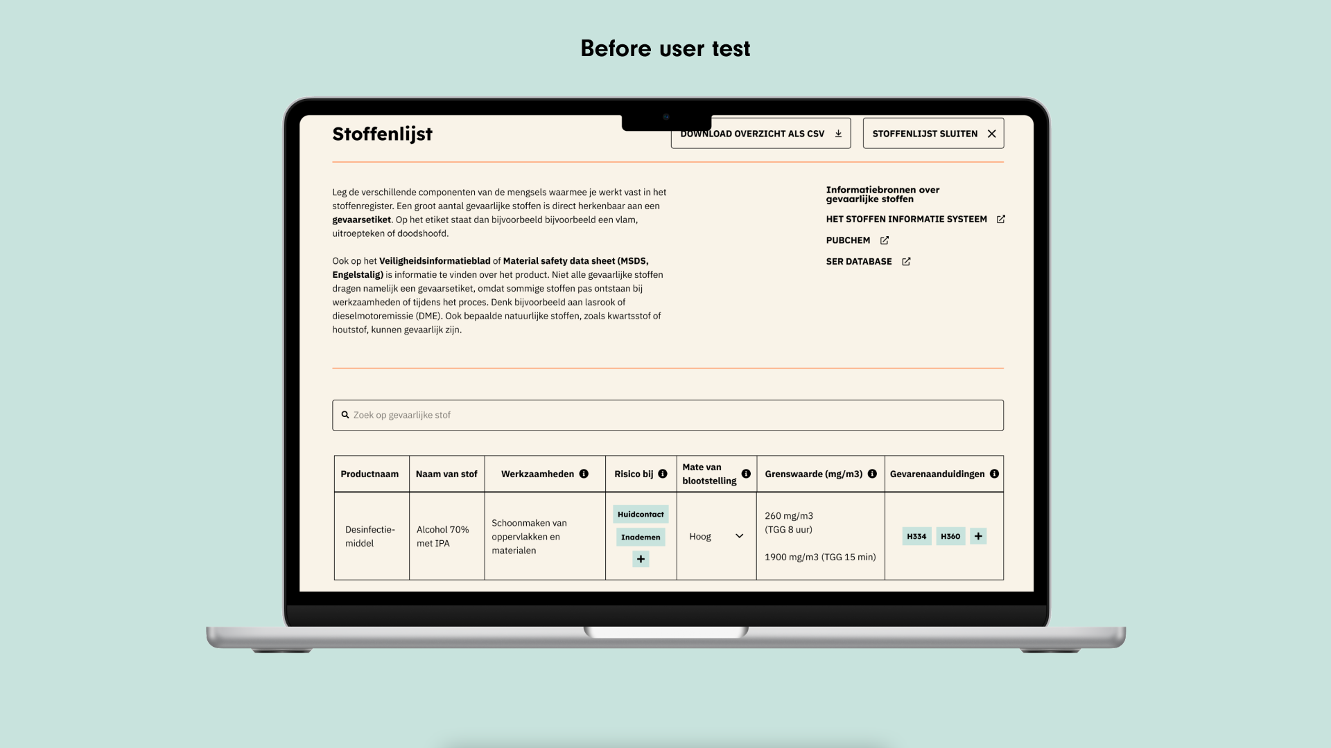
Prototype before the user test
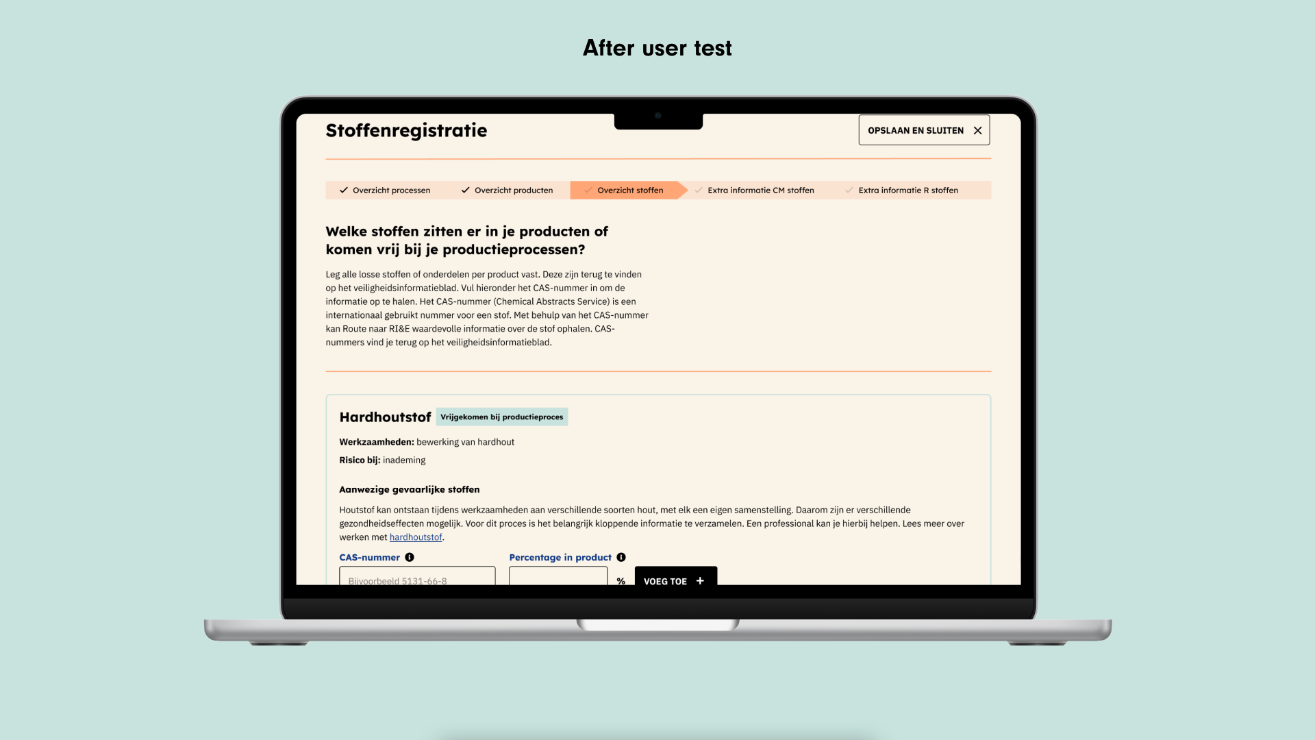
Improved prototype after the user test
While more information became available from our experts I realized the flow was getting more and more difficult.
The section on dangerous substances was starting to get too big and take up too much time from the user which would interfere with completing their RI&E. This made me decide to rearrange the entire flow in the application. This new flow better fitted the wishes of the product owner, the experts were happy with it and made it possible for the user to still very quickly complete the application without getting stuck on dangerous substances.
Curious about the result? I made a screencast of the latest prototype where you can see all the steps a user is guided through to complete their obligations for dangerous substances. I’ve left out some screens in between, but it still clearly shows the complexity of the subject.
Screencast of the prototype for dangerous substances
