Role: UX & UI Design
Client: Ministry of Health, Welfare and Sport (Ministerie van Volksgezondheid, Welzijn en Sport)
Duration: June 2020 - December 2021
View the Corona Dashboard
At CLEVER°FRANKE I was part of the design team that worked on the Corona Dashboard. I joined the team shortly after the first version was released and worked on improving the dashboard since then. I've been very involved in creating version 2 and after that continued on designing new pages and improving existing pages.
To get to the dashboard it is today we made several versions, each an improvement on the one before.
The first version was a minimum viable product that needed to be created in only a few days. However, it didn’t have much room for the dashboard to grow. The second version focused on this growth and giving more guidance to the user. The third version continued on this path by adding the Latest development page and articles. Providing more depth and context. The latest version creates a more flexible and scalable dashboard that can adapt to several future scenarios.
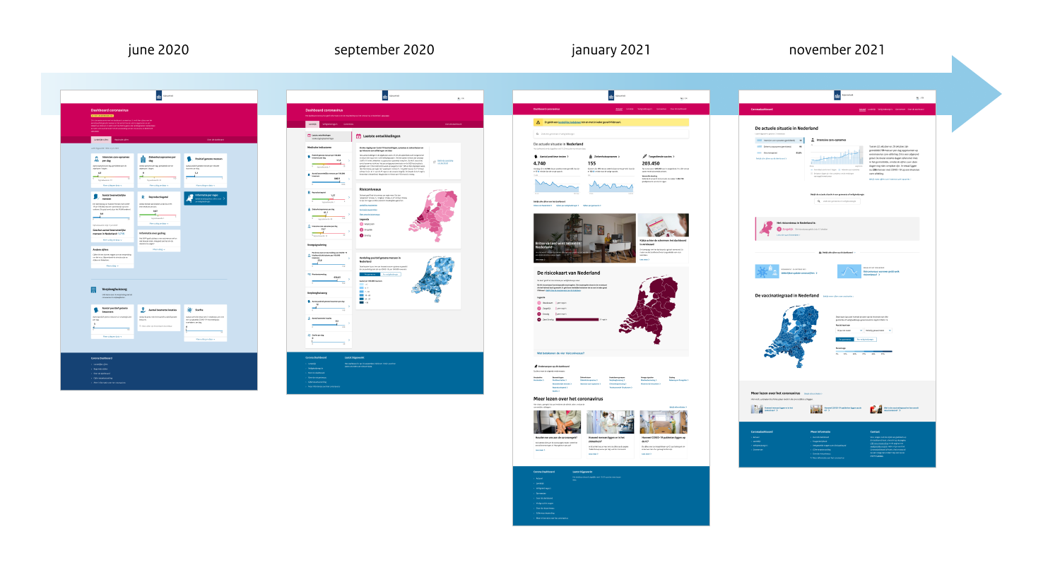
The different versions of the dashboard
Version 1 was a minimum viable product created in a few days. After that we focused on improving the design and adding new information.
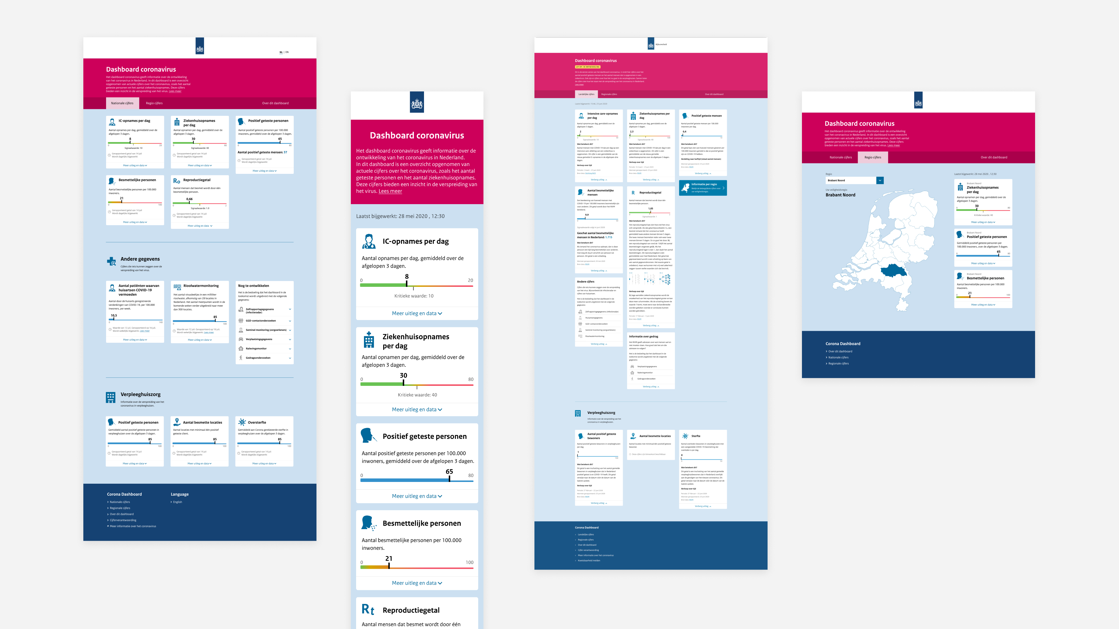
Screenshots of the first version of the dashboard
The different tiles from the first version
We realized soon that the design of the dashboard wasn’t suited for the growing amount of information.
While more and more information became available to display on the dashboard the amount of tiles became overwhelming and unclear. The dashboard needed a new structure that would give the user a quick overview of the situation and allow the user to focus on one type of information.
Screenshots of version 2
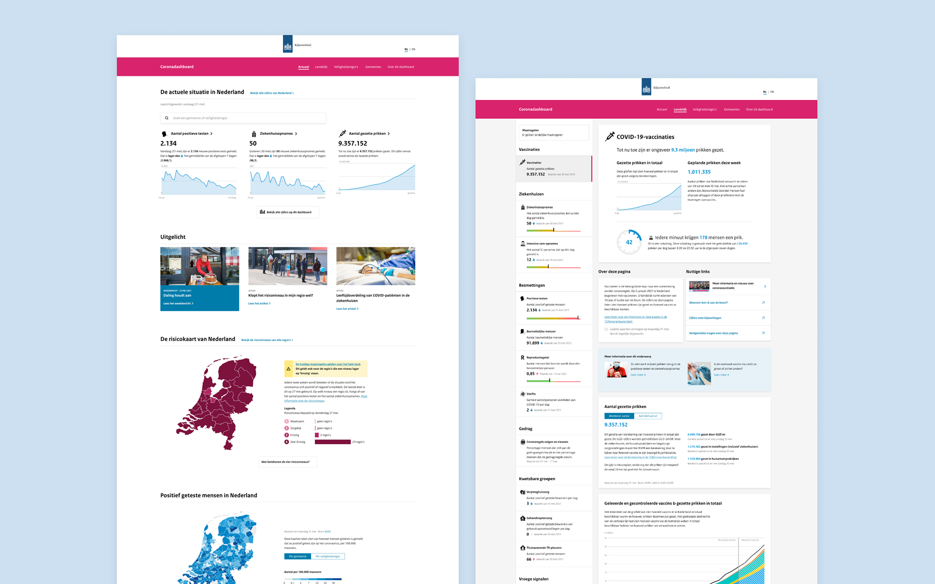
For the third version we focused on providing more guidance for the general public.
The page Latest developments was added that only contained the most important metrics. A user could visit this page every day to see what is the current situation in the Netherlands, without having to go through the other pages. With adding Latest developments we also added more editorial content that explained the data.
Screenshots of version 3
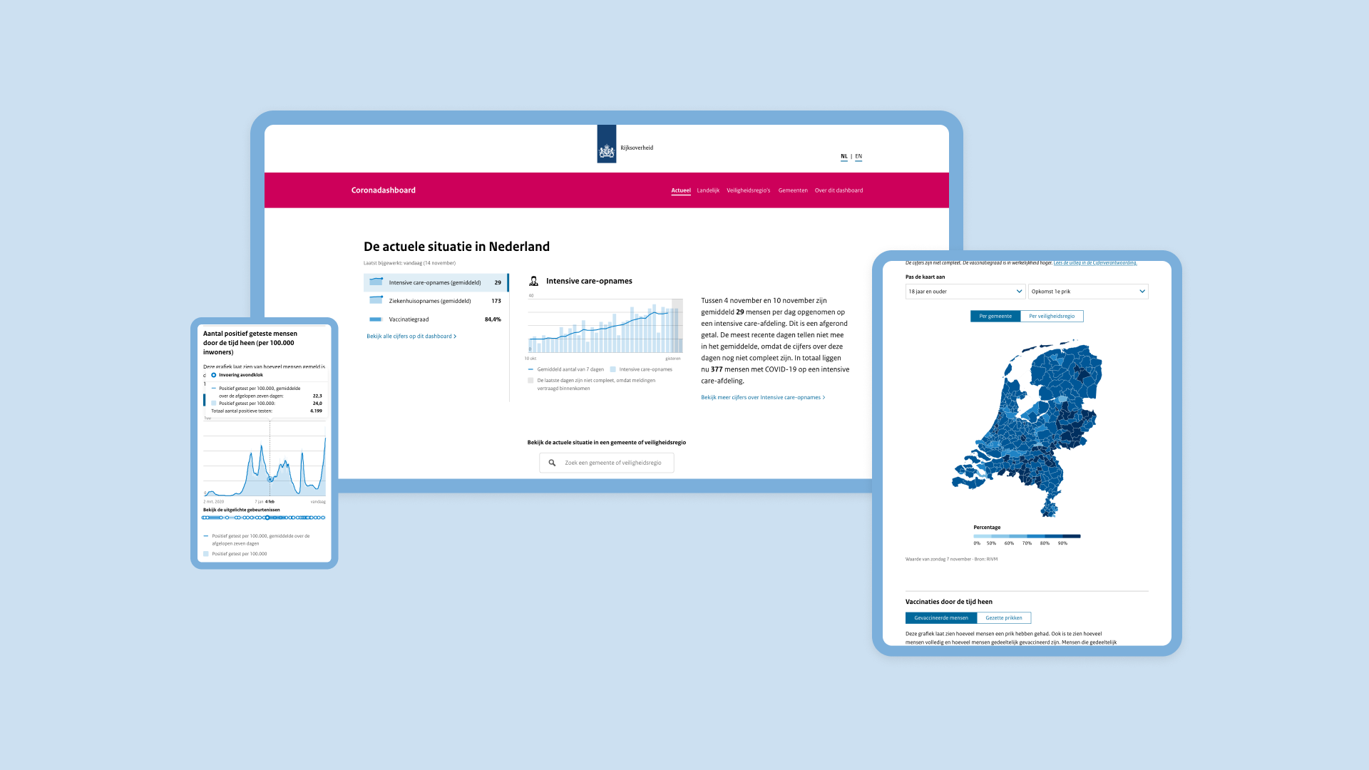
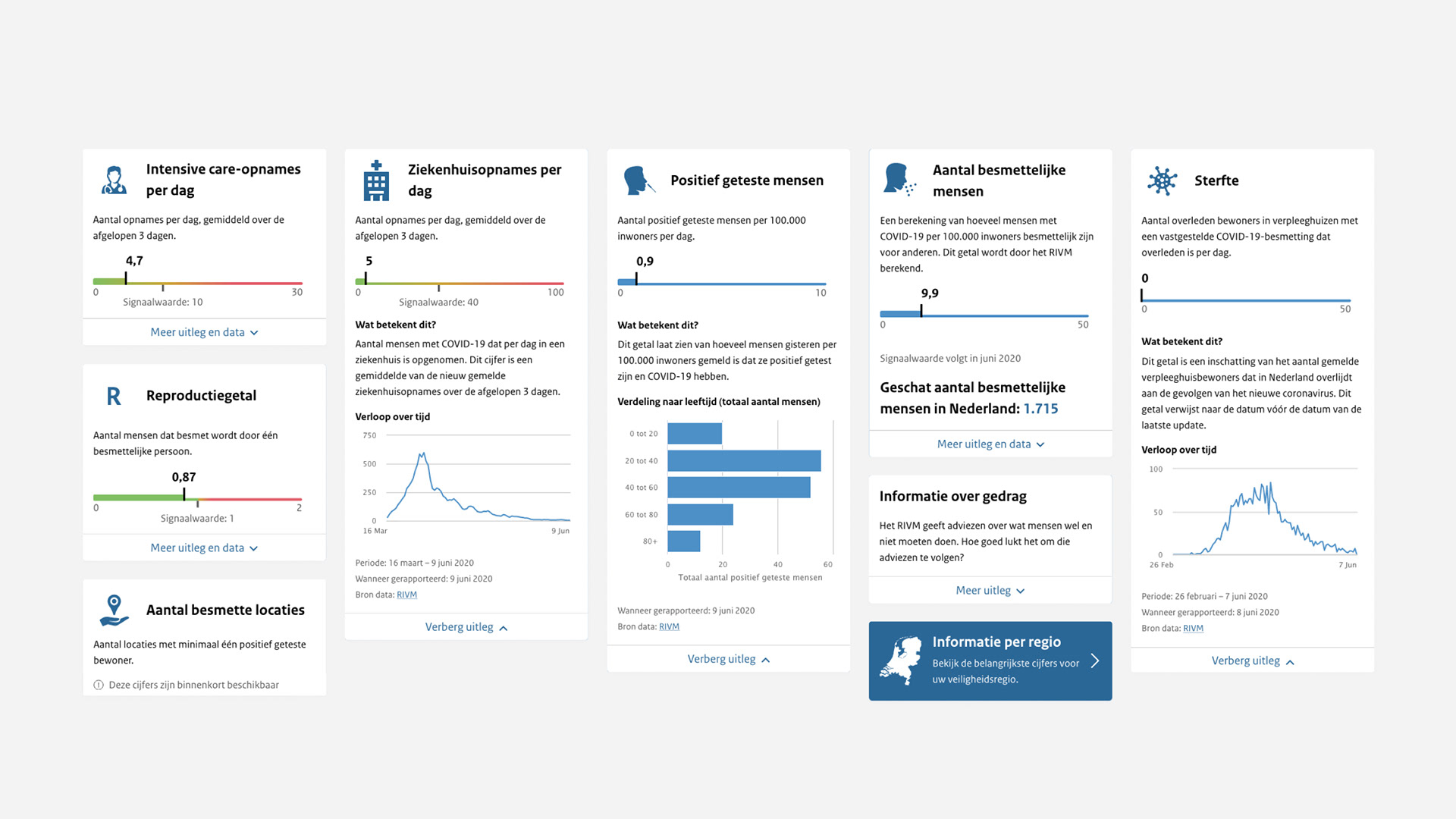
The latest version creates a more flexible and scalable dashboard that can adapt to several future scenarios.
There have been different phases in this crisis and there will be more to come. Numbers have been rising, declining or steadily been high or low for a while. The dashboard needs to be flexible to be relevant in any type of scenario.
We improved Latest Developments to be more dynamic and scalable to meet the needs of different scenarios. There can be four metrics chosen to be shown on Latest Developments, depending on which information is the most interesting for the user. On both mobile and desktop the user gets an overview of the current situation of the most recent value and the mini trend chart which gives an image of whether the number is rising or falling.

Screenshots of version 4 (current version)
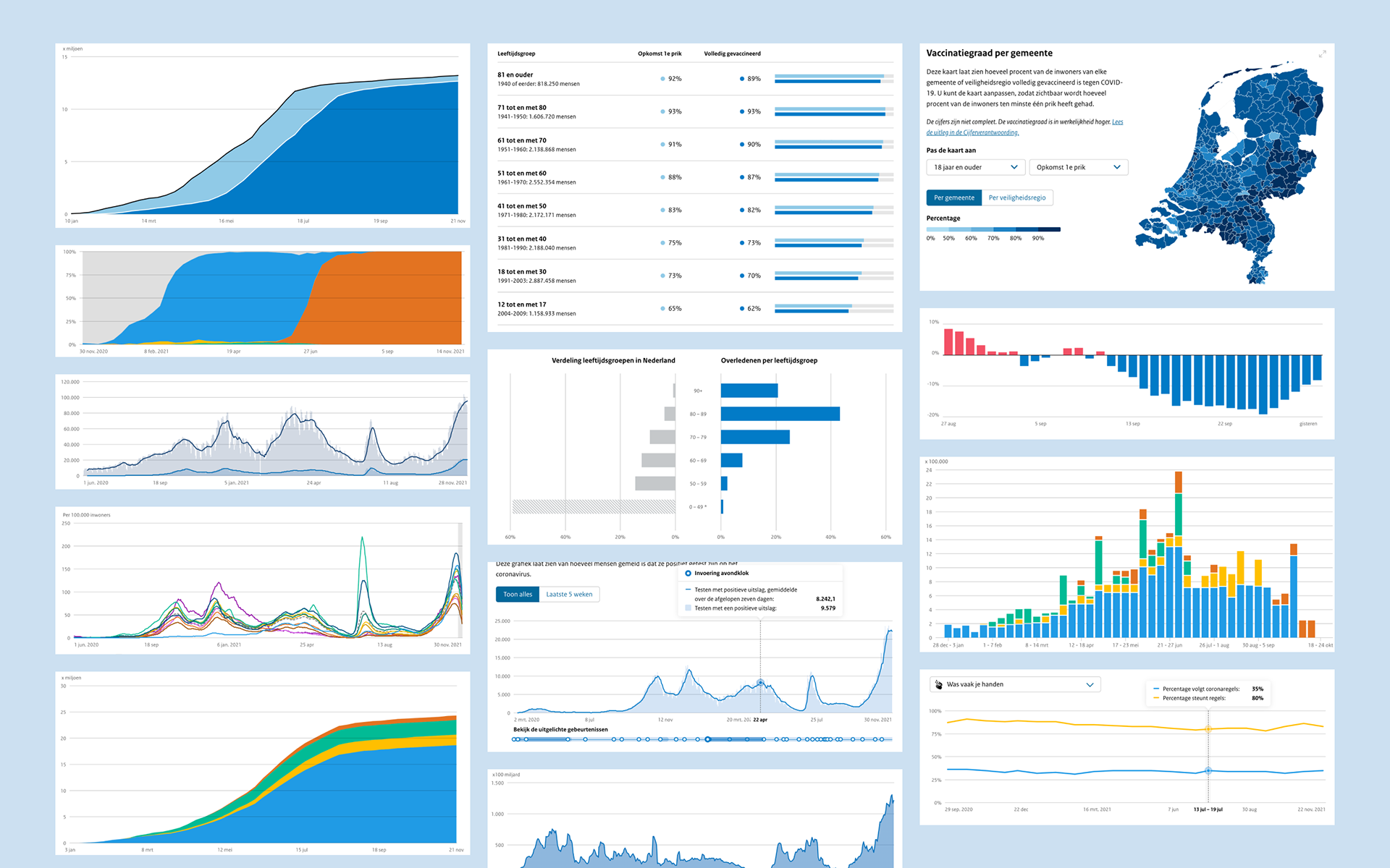
Different graphs in version 4
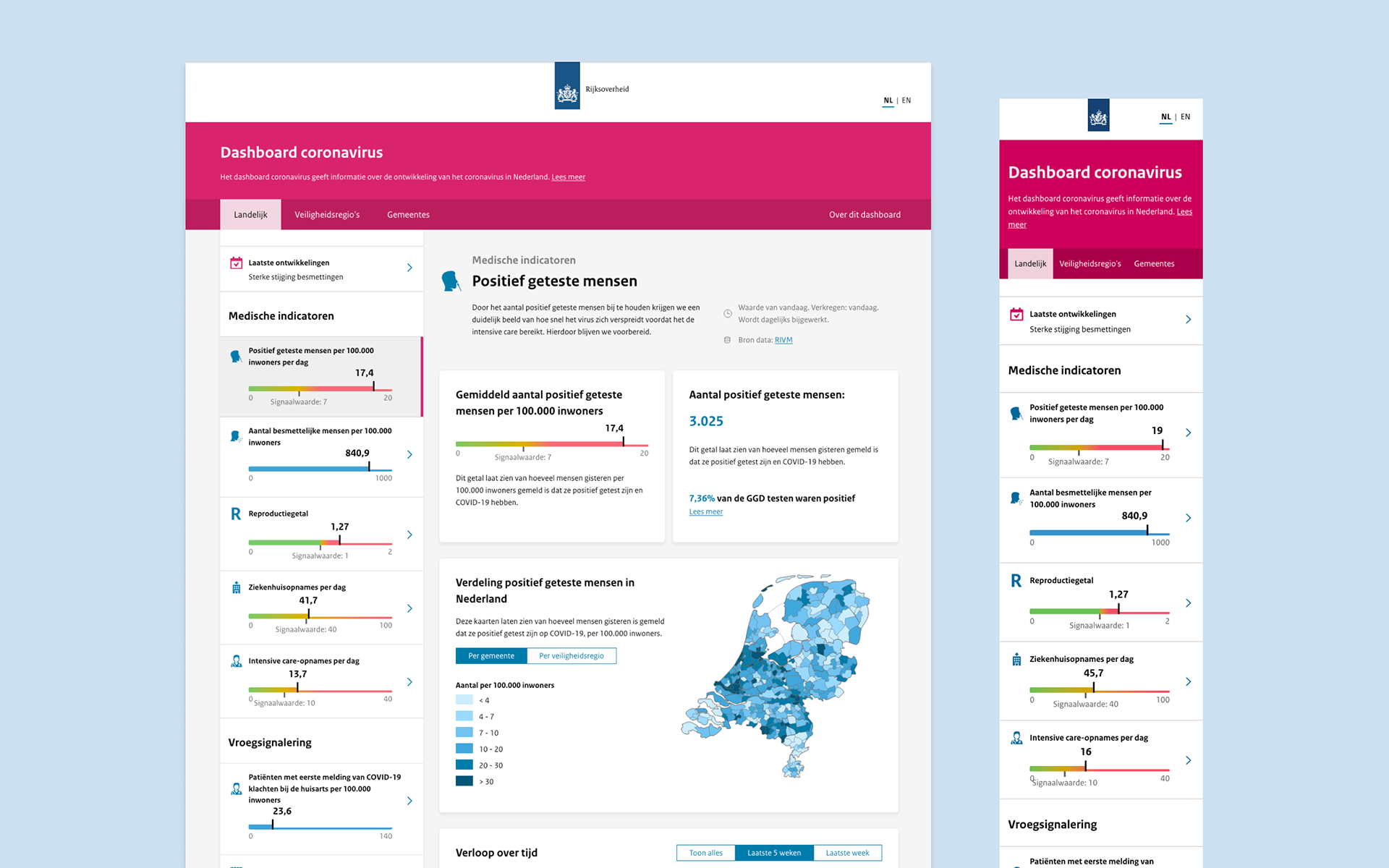
The dashboard has a layered structure to serve several target audiences.
The dashboard has two main target audiences, citizens and policy makers, that exist next to each other. The media is a secondary target audience that overlaps with both groups.
Latest developments is the starting point on the dashboard, this page is understandable and relevant for everyone. From this point the user can dive deeper in the information if this is something he is interested in. The user can get more local information, explore historical data or get more information through articles.

Sitemap